PortuCal Peri Peri
Restaurant Branding
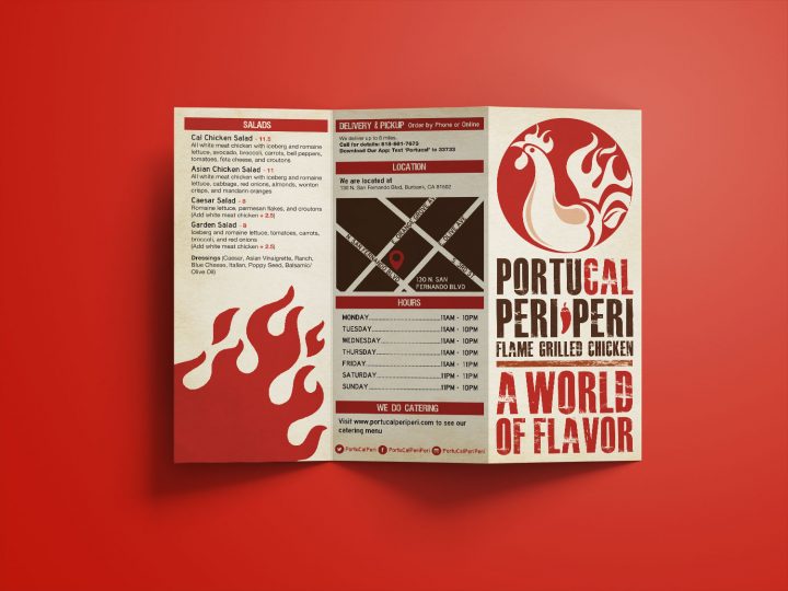
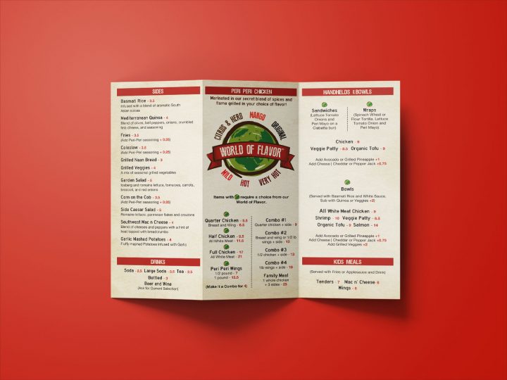
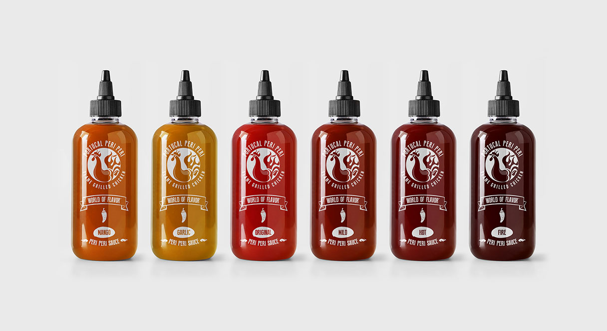
It’s all about the peri peri sauce! One part Portugal, One part California, and two parts flavor = PortuCal Peri Peri. Chicken marinated in a secret blend of spices then flame grilled in a choice of flavor!
Peri Peri means ‘Pepper Pepper‘ in Swahili (an East African Language)
The Brand
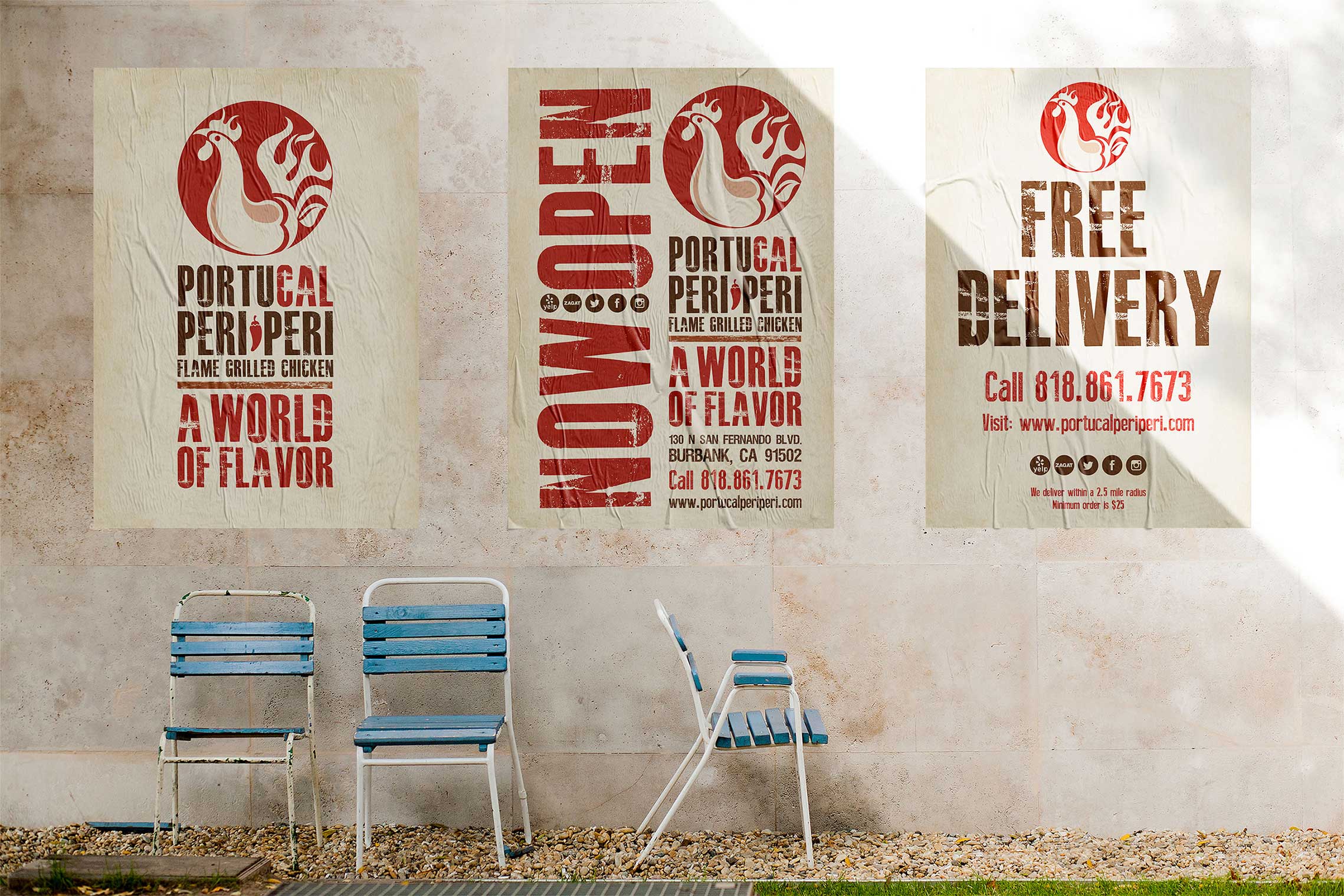
The PortuCal brand is edgy, bold, fun, friendly, intelligent, confident, exotic and distinct. The visual brand identity derives from the PortuCal story, and the history of the Peri Peri pepper.
The Experience
Listening to customers and ensuring they receive the best service is key to the brand experience. This helps to make constant improvements and keeps customers coming back.
From Portugal to California
The Logo
Chicken, pepper, and flames = Peri Peri Flame Grilled Chicken. The PortuCal brand is a Burbank, CA based fast food, for here or to-go restaurant. It offers healthier alternatives to most other fast food restaurants and works perfectly with the California lifestyle.
It’s a story of adventure, travel and exploration
A story of spices traveling between continents and the ultimate discovery of Peri Peri chicken. “A world of flavor” is how PortuCal can be described. Appealing to people who are uninterested in the bland, but are willing to enjoy exciting new flavors.
It’s all about the flavor!
Since it was close to impossible to get a taste of Peri Peri chicken in the USA, this restaurant is a fresh idea! With the most delectable Peri Peri sauce outside of Portugal and unique cooking techniques this concept was destined for success!
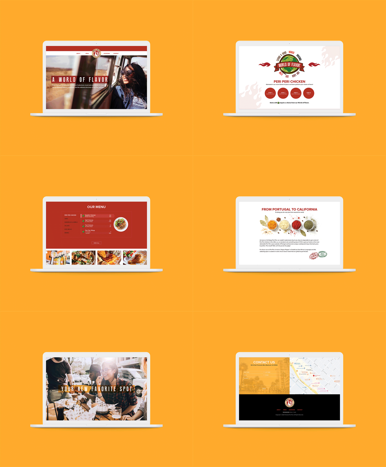
An interactive website
The PortuCal website brings the brand to a digital platform in order for the potential visitor to want to come and check out the restaurant. It also helps visitors to understand the concept and culture of the cuisine they’d expect to enjoy once they arrive. With features such as the food menu, online ordering, and contact details, visitors have all they need to become intrigued with the restaurant.
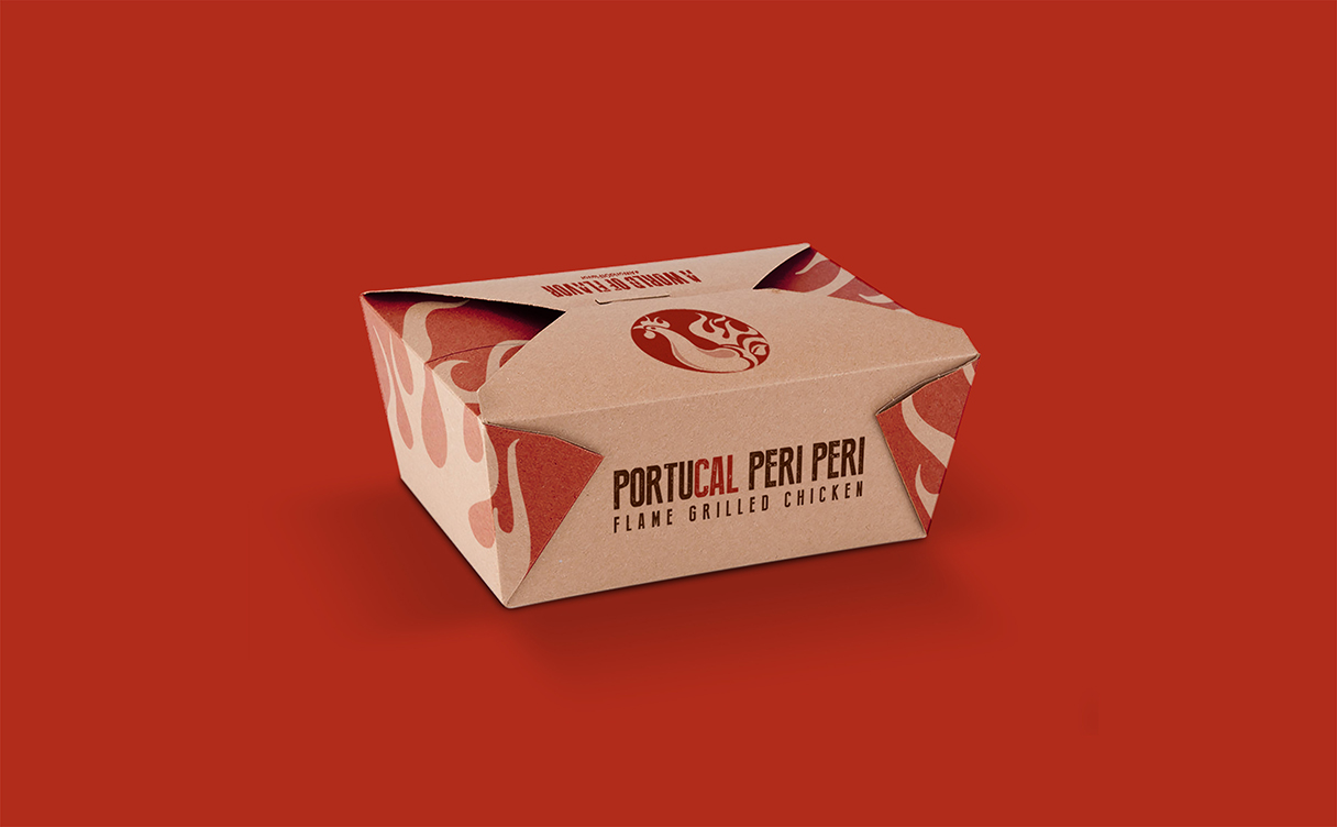
To-go Packaging
We want people to ask where you’ve just come from.
Where’d that box come from? What’s in the box? Can I get one for myself? These are the questions we want to evoke with to-go packaging. Packaging is an extension of brand exposure and the best part is that it comes at no additional cost. You want people to see your brand, be intrigued, and ask questions.

