Simplicity and Clarity
“Simplicity and clarity. Great design is born of those two things”
~ Lindon Leader
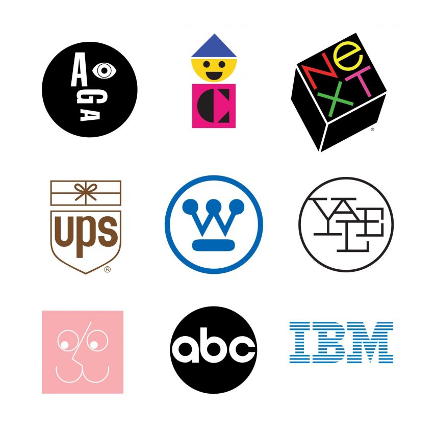
Over a thirty-year career in corporate identity, Lindon has earned significant recognition worldwide, testimony to the merit of his two-word design philosophy: simplicity and clarity.


What
What does Lindon Leader mean? The opposite of simple and clear is complicated and vague and those two things would be a great example of bad design. Great design is easy on the eye and sends a clear message to the viewer.
How
How can we learn from this? There is clarity within simplicity and this is what makes effective design. If we say too much it can overwhelm the consumer and we can lose their attention rendering the delivery of our message a failure. The process of great design plays the part of the listener rather than the talker. Great design listens to the needs of the consumer before it clearly communicates a simple answer, directly meeting those needs.
Why
Why is this important to design? Complicated design with a vague message is a lost opportunity for your business and could be at the cost of you prevailing over your competitors. Great design will portray your message in the most effective way and that is with simplicity and clarity.
FINAL THOUGHT
Adding more text, more messaging, and more images in hopes to get everything you want across in as little time as possible is a common mistake. All this does is overcomplicate the design and overwhelm the viewer; this leads to bad results. The marketplace is an already oversaturated canvas of noise and in order to cut through it you must keep the message simple and the vision clear.


